
| Home | People | Research | Publications | Demos |
| News | Jobs |
Prospective Students |
About | Internal |

| Home | People | Research | Publications | Demos |
| News | Jobs |
Prospective Students |
About | Internal |
| Demo on Realtime Distributed Analytics and Trends | |
|
|
|
This is a visual demonstration of distributed analytics using UCSD Police Department's Pelco Video Surveillance Network. Currently (2012) only the crowd counting analytic is operational. (Note: Javascript is required for dynamic content. However, static versions are also provided.) |
|
|
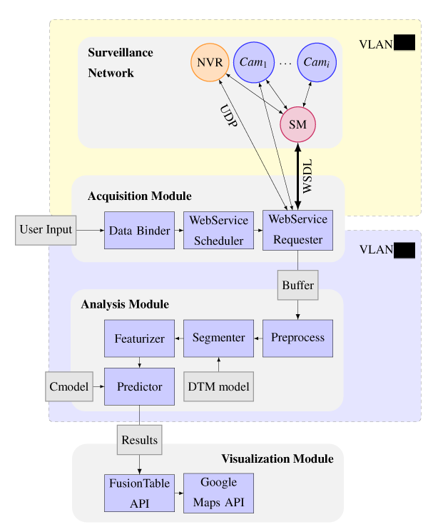
Our system, illustrated right, interfaces a video surveillance system with our labs computational network. Data is pulled in for analysis on a schedule, via the Acquisition Module. Data may be gathered directly from camera devices or from Network Video Recorders (NVR). An extra admin layer to catalog system attributes and maintain timing across devices is provided by the System Manager (SM).
Next, our Analysis Module uses pre-trained models to calculate count predictions, thus utilizing the Crowd Counting Analytic. These results are uploaded to the SQL-like Google Fusion Tables where they may be easily visualized via Google Maps and Charts APIs. The maps below demonstrate the visualization module.
|
|
|
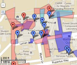
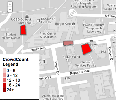
The analytic can be selected for real-time visualization and a map of historic trends. Colored polygons on real-time map indicate current counts, averaged over classes, for that specific geospatial area. These polygons can also be clicked for more information and a scene preview of the area.
If visualization does not display correctly, please view the static version: [Static Version]
|
|
|
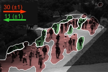
Description: There are three scenes. Each has two vectors emanating from their center. The magnitude of these vectors is proportional to the crowd counts and their direction indicates count class direction of travel. Numbers indicate numbers of individuals in a class prediction.
|
|
|
We propose a time-lapsed version of the above real-time polygon visualization demo so that we may begin to see the dependencies neighboring dynamic crowds have on each other. In this way, we may view the dynamic patterns in weeks and months compressed into seconds and minutes.
|
|
|
| |
![]()
©
SVCL